
V&A Collection & Research Centre
Queen Elizabeth Olympic Park, London, 2018
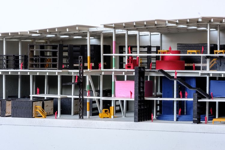
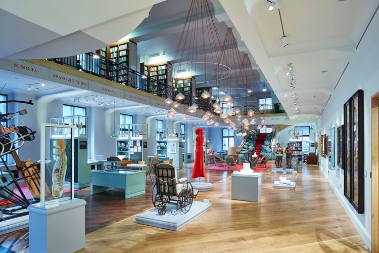
An open museum store, home to the V&A's world-class collection of 2.3 million objects, in the Queen Elizabeth Olympic Park, London.
Designed in collaboration with Haworth Tompkins and a broad team including theatre designers, collection experts and graphic designers.
Contemporary storage sheds present a challenge: How to humanise a vastly scaled space, whilst ensuring the functional efficiency of the collections storage and day to day operations are not compromised?

Theatres have developed many interesting solutions to this challenge; they host wondrous and awe inspiring shows, whilst also facilitating highly technical back of house spaces.
For the V&A's Collection and Research Centre we invited visitors to cross through the ‘4th wall’ to begin a journey of discovery, experiencing the V&A collection from backstage. We animated the collection storage through three theatrical devices.


Welcome at ground floor - a loosely choreographed journey through a series of fluid, interconnected spaces


Gantry at first floor - the adjacencies of study, production and social spaces enable unique moments of expansion and collaboration


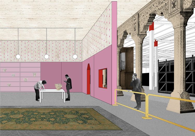
If the collection storage celebrates the spatial dynamism of the 21st century distribution depot, the engagement spaces aim to provide characterful intimacy for study, learning and meeting. Spaces or fragments of spaces from the collection are used as rooms, where possible, allowing the collection to be seen and actively inhabited. Additional rooms are created by sampling found spaces or spatial types, capturing their spatial delight, usefulness and atmosphere. This establishes a temporal richness to the centre and ensures the architecture contributes to object-based explorations.


A range of rooms of different sizes and characters are strategically scattered throughout the building, eye-catchers amidst the public circulation and collections. They are particular, distinct and memorable, a dramatic contrast to the expansive monochrome stores. Their variety provides maximum versatility for the V&A and its visitors, with room use responding to needs.
Made from timber they are simple to construct and easy to adjust as needs change. Wrapped and lined with materials that enhance their usefulness – acoustic felt, pinboard, magnetic sheet – they humanize the vastness of the shed, allowing staff and visitors alike to use, activate and explore the collection.


Supporting new working practices we tested three visitor journeys:
A. The curator
Group size: 1
Typical duration: 7-8 hours

B. The family
Group size: 3-5
Typical Duration: 2 hours

C. The students
Group size: 15-20
Typical duration: 2-4 hours

We speculated where the different visitors paths would cross and tested how objects could nurture serendipity.


International design competition. Second prize.
Client
Victoria & Albert Museum
Location
Here East, Queen Elizabeth Olympic Park, London E15 2GW
Collaborating architect
Haworth Tompkins
Theatre Consultant
Charcoalblue
Structural engineer
Price & Myers
Services engineer
Max Fordham
Graphic Designer
Graphic Thought Facility
Museum storage expert
David Goodwin


